
The flowcharts that we created helped us to figure out what pages were essential and how the pages would connect to one another. We started with rough ideas that developed into finer details for each page and the interactions that would occur.
THE FLOW OF THE APP


THE PROTOTYPING
The basic round of ideation was focused on how many pages we would need to create and the flow between those pages. During this stage we finalized the idea of having four main sections: upcoming events, classes, messaging, and profile.


THE OUTCOME
After researching, experimenting, designing, and creating a purposeful concept behind the elements of the app it was time to begin creating the app. During this process I paid close attention to creating uniformity between elements in each section. I color coded the different sections to better communicate to users which section they were interacting with.
The main sections of the app are: upcoming events, courses + study groups, messaging, profile settings.
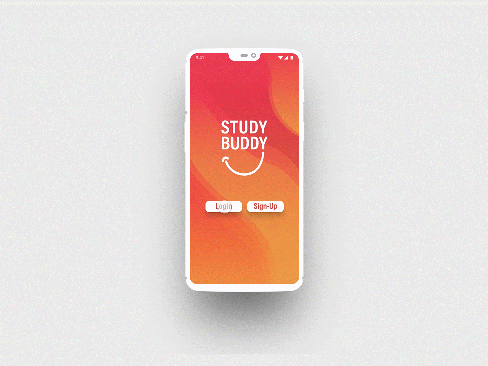
STUDY BUDDY
APP DESIGN + LOGO DEVELOPMENT
THE BRIEF
Create an app that solves a problem you see today.
Study Buddy is an app designed to connect students in the same courses with one another to study in a more social manner. Students input their classes, availability, and study habits to create study groups that will be successful for them.
Using the app students can reserve study spaces at their respective campuses, share class materials to prepare for study sessions, and message one another directly.
Check out the research, prototyping, and full process here!
The general concept and research for this app was in collaboration with Lily Hansen, Hanna Hartt, Angelica Ocampo, and Angel McNabb-Lyons
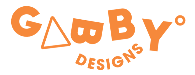
THE LOGO + PROCESS
For the logo of the app I wanted the design to be playful and simple so that it could easily translated into an icon for the app button. I also wanted to merge the two concepts of being a study tool as well as a social platform so that there was more visual communication.

THE LOGO PROCESS
For the logo of the app I wanted the design to be playful and simple so that it could easily translated into an icon for the app button. I also wanted to merge the two concepts of being a study tool as well as a social platform so that there was more visual communication.